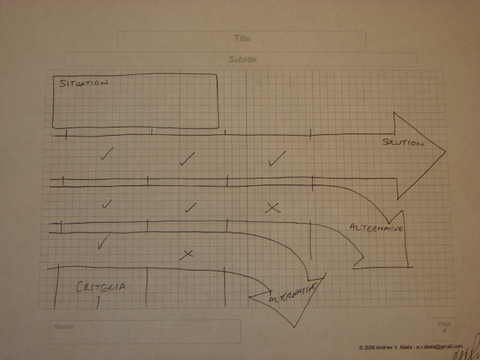
I am in Redmond, Wa. all this week running workshops at Microsoft. One of the participants in yesterday’s Extreme Presentation workshop, Ian Peacock, a product manager at Microsoft, came up with an interesting example of a page layout that I had not seen before.
The layout represents three options that are screened through three criteria, which eliminate the first two options, leaving one option that satisfies all the criteria. Thanks Ian.
