On Wednesday I met with Nathaniel Pearlman, who once studied under Edward Tufte, and who is the founder of Timeplots. Timeplots creates outstanding information graphics and sells them in poster form. Their first three efforts are timelines of the US Supreme Court, Senate, and Presidency.
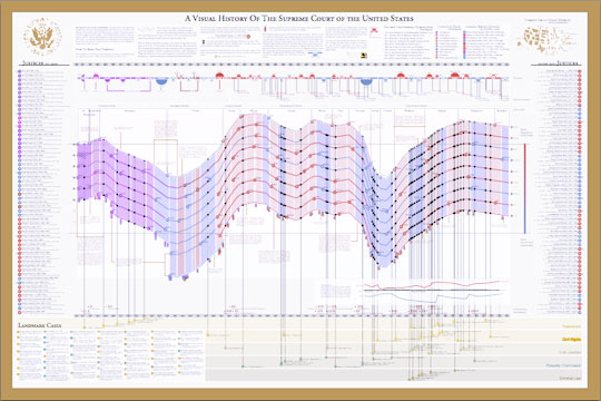
This is the Supreme Court graphic. The main timeline in the middle shows the length of time each justice served, and the up or down direction is determined by the number of sitting justices appointed by each party (up is Republican, down is Democrat). The smaller timeline across the top represents the US Presidents' individual influence on the Court, illustrated with colored semicircles. The color of course represents party affiliation, while the size of the semicircle represents the total number of days each President's appointee(s) served on the Court.
The chart is beautifully designed. The image below doesn't do it any justice. Go to their site and use the zoom feature to examine it more closely. Better still: buy your own copy of the poster. They are a very reasonably priced, at $45. I have this one and the US Presidents one here in my office.
If you have any ideas for additional Timeplots, let me know, and I'll pass the information on to Nathaniel.
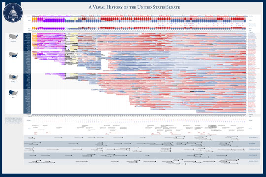
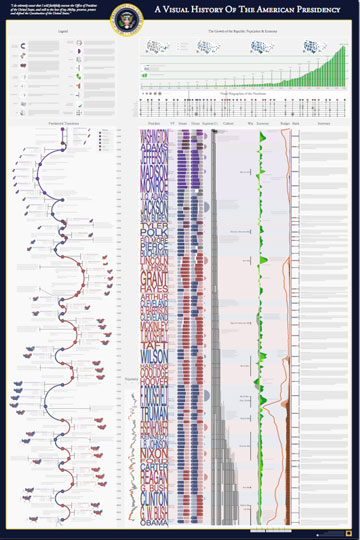
Here are the Senate and Presidents posters.


