Earlier this year, the Extreme Presentation blog reached its fourth birthday. To celebrate, I would like to offer a “best of” listing. I took the ten most popular posts as measured by past six months' traffic, and with some minor modification, here they are; they provide a pretty good cross section of the work I've done on this blog in the past four years.
Among the many interesting things that Edward Tufte has
written about in his four treatises on information display, none is more
powerful, to my mind, than his two key elements of graphical design. Tufte
writes: "What makes for such graphical elegance? … Good design has
two key elements: Graphical elegance is often found in simplicity of design
and complexity of data."
Simplicity of design and complexity of data. These two
elements, it seems to me, are at the heart of everything that Tufte teaches.
And I think that the second one – complexity of data – explains much of his
dislike for PowerPoint. PowerPoint, used in the usual way, does not encourage
complexity of data. The challenge, of course, is how do you combine simplicity
of design with complexity of data? One answer, I think, lies in what designers
call the "squint test": when you squint at your page, so that you
cannot read any of the text, do you still 'get' something about the page?
 Each presentation situation calls for a particular
presentation idiom—a form of expression and a set of design principles.
Contrary to the popular complaint, the problem with PowerPoint™ is not that it
forces you to design a presentation in a particular way. On the contrary, it
doesn’t. And that's the problem: PowerPoint allows you to mix design elements
from different idioms, which, I believe, accounts for much of the ugliness and
ineffectiveness of most presentations.
There are two fundamental presentation idioms, which I call
Ballroom style and Conference Room style. The Ballroom style presentation is
what most typical PowerPoint presentations are trying to be: colorful, vibrant,
attention-grabbing, and (sometimes) noisy. They typically take place in a large,
dark room such as a hotel ballroom.
The Conference Room style presentation is much more
understated: less use of color, more details on each page, printed rather than
projected, and more suited to your average corporate meeting or conference
room.
- Setting
presentation objectives in terms of what the presenter intends to do, rather
than how the audience should change their minds and actions as a result of the
presentation. - Focusing on
what you want from your audience, rather than on how your presentation will
help them solve a pressing problem of theirs. - Only
including evidence that supports your recommendation, instead of providing an
objective evaluation of all the evidence, for and against. - [more]
It's
easy to be passionate when your material is inherently fascinating. What do you do
when you're dealing with boring data?
With the
explosion of interest in information visualization, I find taxonomies of
visualization approaches to be very useful in organizing knowledge and
facilitating use of different visualization approaches.
This post
identifies three useful taxonomies.
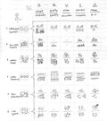
Dan Roam's
Visual Thinking Codex (left), from his delightful book The Back of the Napkin, strikes an excellent balance between
simplicity and comprehensiveness.
The Codex can be found on p. 141 of Dan's book. With his permission, I have reproduced
it in my blog post (although I highly recommend that you get a copy of the book).
Also
included in this post are the Periodic Table of Visualization Methods, hosted by the
impressive Swiss Visual Literacy project, and of course my own Chart Chooser
(#1 above).
What would I like to see in slide design in 2009? I would
like to see presenters realize that there is a place for simplicity and a place
for lots of detail–and the main thing is to know when to use each.

How should the presenter handle the transition between
slides within the handout?
One way to solve this is to vary your language. Some times you'll say "turn to the
next page"; other times "on page 3 we will see how… etc." Keep
in mind that with conference room style presentations, you end up with far
fewer slides than with ballroom
style: typically between 3 and 6,
and occasionally even 2 or just 1 outstanding slide. So your audience won't be turning the page very often.
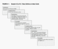
An even better approach is to design your presentation
storyline using the S.Co.R.E. approach (Situation, Complication, Resolution,
Example), in which case your transition is actually part of the story. [more]
***
Thanks for following this blog–I hope you are finding it valuable. If you have any thoughts about anything you'd like to see here, please feel free to comment on this post.


