With the explosion of interest in information visualization, I find taxonomies of visualization approaches to be very useful in organizing knowledge and facilitating use of different visualization approaches.
The Periodic Table of Visualization Methods, hosted by the impressive Swiss Visual Literacy project, is the most comprehensive visualization taxonomy I have seen. It divides visualizations into Data, Information, Concept, Strategy, Metaphor, and Compound Visualizations. Each of these is then classified as a process or structure visualization, and further subdivided into whether they show detail, overview, or detail and overview, and whether they support convergent or divergent thinking.
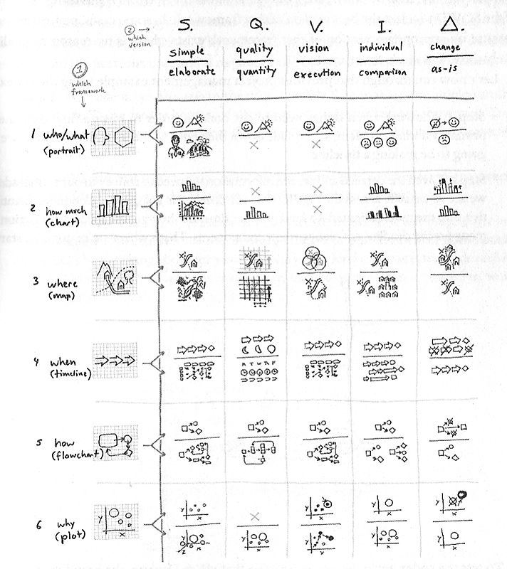
Dan Roam's Visual Thinking Codex, from his delightful book The Back of the Napkin, strikes an excellent balance between simplicity and comprehensiveness. The Codex can be found on p. 141 of Dan's book. With his permission, I have reproduced it here (although I highly recommend that you get a copy of the book).
The vertical axis is organized approximately around the intuitive structure of who/what/where etc., while the horizontal axis uses Dan's SQVID structure: a series of five contrasts that help you define the focus of your visualization: simple vs. elaborate, quality vs. quantity, vision vs. execution, individual attributes vs. comparison, and delta (change) vs. status quo.
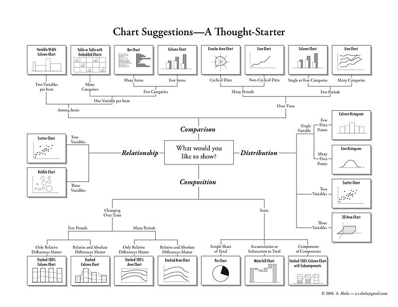
My own contribution to this is the Chart Chooser graphic, which some of you have seen. (Which is also available in Japanese and Portuguese, courtesy of a couple of readers of this blog, and which the good folks at Juice Analytics turned into a small online application, available at www.ChartChooser.com)

