Among the many interesting things that Edward Tufte has written about in his four treatises on information display, none is more powerful, to my mind, than his two key elements of graphical design. Tufte writes:
What makes for such graphical elegance? … Good design has two key elements:
Graphical elegance is often found in simplicity of design and complexity of data.
(p. 177 of The Visual Display of Quantitative Information, facing the page that displays Minard's graphic of the Napoleon's Russian march and retreat, which Tufte has made famous).
Simplicity of design and complexity of data. These two elements, it seems to me, are at the heart of everything that Tufte teaches. And I think that the second one – complexity of data – explains much of his dislike for PowerPoint. PowerPoint, used in the usual way, does not encourage complexity of data.
The challenge, of course, is how do you combine simplicity of design with complexity of data? One answer, I think, lies in what designers call the "squint test": when you squint at your page, so that you cannot read any of the text, do you still "get" something about the page?
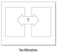
The layout of your page or slide should communicate, or at least support, the main point of the page. So, for example, if the point of your slide is that you audience is facing two alternatives, why not lay out the page with the two alternatives, one on each side? Squinting at this page, one would see that there were two things placed apparently in opposition to one another. The squint test simulates the very first thing to hit your brain when you see a new page or slide. If the very first thing you see introduces the main point of the page to you, then the rest of the communication will flow easily.
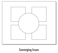
Here's another example. Say you're making the point that a bunch of things are coming together to create a new situation. Lay out the different things that are coming together around the page – in this example, in the four corners of the page – and then put the new situation in the center of the page. The "things" can be represented by pictures or graphics ideally, but even if all you have is bullet points inside each of the squares and the circle, the audience will still get the point that you have a number of things converging towards one thing.
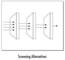
Or if you're explaining how you've screened a number of ideas and selected one. Lay the different screens out across the page, name each, and perhaps list the ideas that were screened out at each stage, and the ones that made it all the way through.
There are potentially an infinite number of layouts. We've developed 36 so far, and I plan to show more of them in a subsequent post. These were inspired by the work of Gene Zelazny in his book Say It With Charts.


